Responsive email design: the key to better engagement
Published in august, 01 of 2016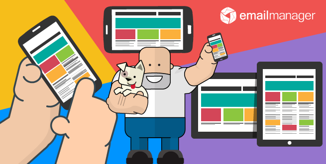
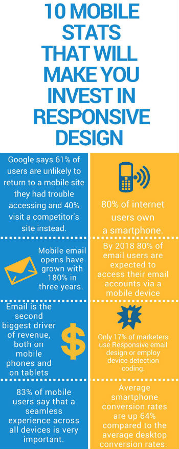
You probably read the headline above and thought: "Gosh, another blog post about responsive design. I already know that I should use it!" But, do you? If you actually research about responsive design in the net you will find tons of articles and blog posts listing the benefits and reasons for creating a mobile version of your website, emails and so on. But the sad truth is that only 17% of marketers use responsive email design or employ device detection coding.
This is a staggering data, especially when you know that 55% of email is now opened on a mobile device. So if you haven't optimized your email marketing strategies for mobile yet, you're already late. In case you already done so, bear in mind that content also matters. If your emails, websites or landing pages have any sort of malfunction when it comes to mobile visualization your chances of losing your customers are higher.
Mobile is not the future, it is the now. Meet your customers in the environment of their choice, not where it's convenient for you.
(Cyndie Shaffstall)
So, how to keep your customers happy when it comes to mobile optimization? Let us show you the way:
- Responsive design in marketing strategies
- Responsive email design best practices
- The impact of responsive design on email engagement
- What to do next?
Responsive design in marketing strategies
So, we already know that the number of mobile devices just keep growing around the world.We have reached a stage where the telephone feature of the smartphone is far from the primary function of the device. And this is good news for digital marketing professionals.
Recently data suggests that smartphones will reach 90% penetration in countries like US and UK in 2016. With numbers like that, we expect to see that most marketing professionals (if not all) are investing in responsive design and mobile optimization. Nevertheless, the numbers don't show that. On average just 30% of digital marketing budgets are being spent on mobile. To make things worst brands aren't meeting consumers mobile expectations.
A survey by Sitecore Mobile found that only 24% of customers believe that brands are meeting their expectations when it comes to user experience (the design and functionality of the site or app) on mobile devices. And when asked what would they do if their expectations are not being completely met by brands, a third of them said they would never buy from the brand again.
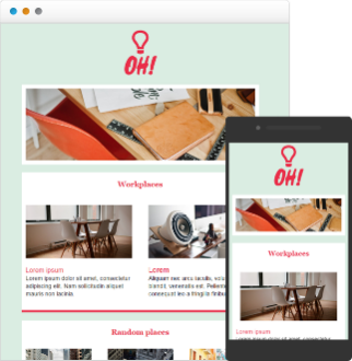
But what about email marketing and responsive design? Well, building the appropriate design and optimizing your content for mobile does makes the difference. However, most of the companies are only creating templates that work on all devices (52%) and not focusing on optimizing every aspect of the email. This is a big NO NO. To achieve the conversion and engagement rates that you are aiming for you need to optimize everything. This means reducing copy, resizing images, leaving blank spaces around buttons to avoid missed clicks and so on.
Remember: mobile email opens have grown 180% in the three years!
Responsive email design best practices
Consider this: around 73% of customers use mobile devices to access their email accounts; 42% use their smartphone to triage their email inbox; 31% state that they use their phone as their primary email device and 69% delete emails that aren't optimized for mobile. So, yes, you have a lot of work to do.
But where to start? Here're some best practices:
Study your audience: which apps and programs are your customers using to open your emails? Outlook? Apple Mail? Gmail? You need to know that to define which layout should be used. For example, Apple supports videos; Outlook does not support background images or text shadows. And so on. Keep in mind that if your email doesn't look good on a mobile device you better ditch the strategy. After all, 42% of people say they would delete an email if it doesnt look good on their mobile device and 4% would unsubscribe.
Bigger fonts, easier read: small fonts are hard to see on the desktop never mind on small devices. Use big and legible to fonts to ensure your customer can quickly scan your email.
Big and clear CTAs: your CTAs should be placed in the center, with enough clear space around them so your customer can easily click on them. Use legible and big fonts, and contrasting colors.
Concise content: remember that people are most likely to scan your email. They might save it or delete right away. Your text should be concise, straightforward and legible. 44% of customers say that mobile emails are difficult to read because of excessive scrolling. So get rid of extra links, text or images. To make things easier use one-column layout.
Resize your images: or use device detection to target images to dynamically display offers within the email that are optimized to a subscribers specific device.
Beware of images blocking: some apps and programs block images. Consider them when optimizing your email for mobile devices. You still want your message to get through even if your customers can't see your images. Use alt texts and keep the right balance between texts and images so your email doesn't look bad in the inbox.
Think of the inbox: remember that your email will show up in your customer's phone inbox. Subject lines should be short and objective. Sender names have to be trustworthy and recognizable. When possible use the pre-text so you can give your customer a preview of the content of what comes next.
Test over and over: find out how your email looks like on mobile devices before actually sending them. You can test everything: images, templates, subject lines, headlines, CTAs and much more.
Consider A/B testing: to improve your engagement rates and see what works better for your audience. Send different versions of your emails to a group of people and analyze their reactions. You can then chose what gives your better results and start your campaign.
The impact of responsive design on email engagement
So far so good. We've told you why you should have a responsive email design and how to do so. Now we are going to tell you what you can get from that.
There are a few pieces of research that prove that responsive email design gives you higher click-through rates: responsive design results in a nearly 15% increase in unique clicks for mobile users. Another research shows that responsive emails have a 21% higher CTO than non-responsive ones. And it's not only that. More clicks lead to more conversions. On mobile phones, email marketing generated 26.7% of sales, compared to 20.9% on desktop. In 2015, mobile represented 22% of all email-generated revenue.
To better display the great results of responsive email design we have selected a few case studies:
- CareerBuilder: after implementing responsive email CareerBuilder achieved a 15%-17% increase in open rates and a 21%-24% increase in CTR.
- Weird Fish: achieved 10% increase in CTR after adopting responsive email templates.
- Footwear manufacturer Deckers: moved to responsive email design when found out that most of its subscribers were opening their email on mobile devices. Before doing the transitions they ran an A/B test that showed a 10% increase in click-through rates and a 9% increase in mobile opens.
Average smartphone conversion rates are up 64% compared to the average desktop conversion rates.(CMS Report, 2015)
It's clear that if you have a responsive email design you'll probably have higher engagement rates, but you shouldn't stop there. You must continue to adjust your strategies to appeal the always changing customer preferences and behavior. Nurture them and keep them constantly engaged.
What to do next?
Like any other email marketing strategy, your mobile email campaigns have to follow certain rules to keep your customers engaged.
We have selected 3 best practices that will empower your campaigns.
Frequency: frequency always matter. Watch out for consistency. Try not to be to be annoying nor too absent. You customer need to know that you follow certain frequency rules so they know when to expect your emails.
Relevance: relevance is what makes your customers stay tuned. Keep offering emails that are relevant to them. In the case of mobile devices relevancy has an even stronger weight. Mobile users tend to scan through emails more quickly than on desktop. So focus on strong, short subject lines to grab their attention from the beginning.
Personalization: it's no secret that personalization is the most powerful weapon on email engagement, but some marketing professionals fail to deliver personalized emails on mobile devices. To improve your customer's experience try using dynamic content. Using content that changes according to behavior, gender and so on can add a wow moment to your email campaigns.
In 2016, mobile ad spending is projected to top $100 billion. This means more than 50% of all digital ads. However to succeed in mobile marketing is mandatory to understand the difference in customer's behavior when dealing with mobile versus desktop. Responsive design goes beyond layout. Optimize your mobile strategy so all your content fit on smaller screens.