Why apply the responsive design in email marketing?
Published in january, 05 of 2015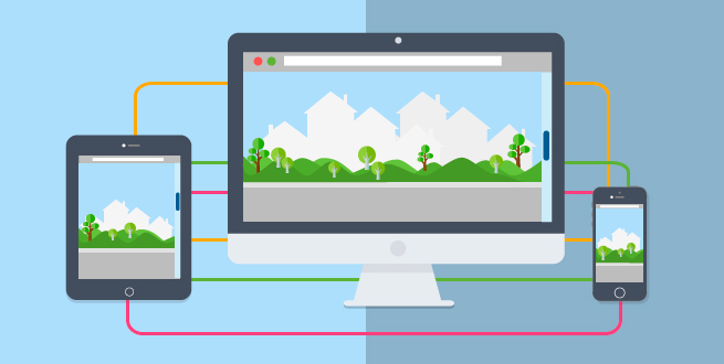
Have you noticed changes in a website or blog when accessing from your computer, tablet or smartphone? A while ago, desktop was the only way to surf on the internet. Today the scene is quite different. With the growing number of supporters of tablets and smartphones inserted in a society increasingly out of time and that prioritizes remote access to information, content can be viewed from screens 2 to 5 (cellphones), from screens 6 to 11 (tablets) and even on 50 TVs.
To meet this reality and still to impact many people, the content should be formatted according to the various screen resolutions. This adaptation that follows the screen resolution of each device in which content is accessed is known as Responsive Design.
As the name implies, responsive design responds to the screen size and fits it the best way. In other words, you dont need to create two or more separate sites, just a single website that will be adapted for mobile and desktop.
What matters the most, however, in this concept pioneered applied by Ethan Marcotte is not the size of the screen, but the resolution. It must be considered when planning the design, since the resolution of an iPhone, for example, can easily approach a computer. To assist in the task of detecting these characteristics so the contents can be seen in different ways and in different contexts, you can use the Media Queries, also known @media.
Understand the concept of Media Queries
The Media Queries are derived from Media Types, concept previously used to define and direct the CSS formatting for the different ways of access. In other words, its a set of styles based on CSS3, which act as conditions or dynamic rules to guide the visitor to your website or the reader of your newsletter according to the device he is using to access it, making it the most legible as possible under different screen sizes.
- All: for all devices.
- Braille: for tactile devices.
- Embossed: for print in Braille.
- Handheld: for mobile devices with small screens and limited connection to the internet.
- Print: for print on paper.
- Projection: for presentations as PPS.
- Screen: for displays or devices with color screens and high resolution.
- Speech: for voice synthesizers.
- Tty: for devices with fixed grid to display characters such as teletypes and terminals.
- TV: for devices such as televisions.
Besides the type of device, you can set size, orientation, proportion or resolution, ensuring greater accuracy when the CSS is applied.
|
link rel="stylesheet" href="estilo.css" type="text/css" media="handheld"
|
|
link rel="stylesheet" href="estilo.css" type="text/css" media="screen"
|
Note that in the examples above, the first is aimed to mobile devices with small screen, while the second has a desktop with big screen. The resolution, however, wasnt the focus, creating problems for mobile devices like the iPhone, for example, with high resolution. So the adoption of Media Queries, as here is defined the CSS formatting for specific scenarios.
|
link rel="stylesheet" href="estilo.css" media="screen and (max-width: 480px)"
|
In this example, the formatting will be applied to devices with high resolution and with a maximum width of 480px. In addition to this, there is a list of features that can be used to indicate the devices such as device-width, height, device-height, orientation, aspect ratio, device-aspect-ratio, color, color-index, monochrome, resolution, scan and grid. There are also three logical operators to limit or expand the scope of formatting: not, or (can be replaced by commas) and only.
After defining the different behaviors and formatting for each type of device, you should set a friendly layout keeping the same visual line and content for all devices. A good example is the A List a Part. And here you can see a compilation that brings together 50 models and best practices. Another great site that brings a series of GIFs with some visual concepts for responsive design is the Froont.
After all, in addition to adapt to the screen you use, the responsive design changes itself to improve your usability.
How to apply responsive design in email marketing
The email is definitely coming with full force to mobile. The ratio of emails opened on mobile devices, according to a report of Return Path, was 60%, 20% only by iPad. This number could be higher if the campaigns were better optimized to meet this audience. This is because users of smartphones and tablets also consume information via desktop, ie, a multiplatform experience.
Studies also indicate people look their smartphones about 150 times a day. Another important factor that should be taken into account is that 80% of users remove emails that dont adapt to their devices.
When creating email marketing campaigns, the goal is to promote the best possible browsing experience to the user through a more attractive newsletter to mobile devices, creating greater engagement and clicks, as well as serving as an independent information access.
You can offer a new way of navigation, increase or decrease fonts, change colors, redesign highlights (menu, sidebar ...), change or hide content.
First you must consider any mobile device no matter the brand or how unknown it can be. Therefore, every detail will be extremely important for the design to be fully functional.
- Think of the minimum font size for the text.
- To clickable icons, the minimum size recommended is 44x44 pixels, so the user chances for outside clicks is much lower, not to mention its also a way to improve your browsing experience.
- Opt for measures in percentage so they can fit regardless of screen sizes.
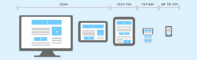
- For desktops, the width of a template must have 640px including the possibility of splitting the content into columns. For mobile devices, the ideal is to use only one column due to the small size of the screen.
Dont forget to test the responsive design in various email providers, including different mobile devices to ensure that things will turn out as you plan.
This type of email is compatible with iOS Mail app, Android 4.x Email (OEM) app, Windows Phone 7.5, BlackBerry OS7 and BlackBerry Z10. And its incompatible with: iPhone Gmail app, iPhone Mailbox app, iPhone Yahoo! Mail app, Android Gmail app, Android Yahoo! Mail app, BlackBerry OS5, Windows Mobile 6.1, Windows Phone 7 and Windows Phone 8.
So showing an appropriate layout for each type of device is no longer a luxury or differential item, but a key element in promoting better usability and accessibility experience to the user. Further, Click Through Rate increases, so does the reading.
When we think about technology a lot can still come ahead and we just cant imagine how further it can go, but what is certain today for sure is that we can no longer restrict the design to 1024 pixels wide from a desktop. And through responsive design, email can be simplified so as to generate an enjoyable read and improve interactions with small screens.
Did you like the content? Share it!
We are at social networks, so go there and tell us what you think about the tips we posted to you!
Facebook, Twitter, LinkedIn, Google+
Do you have any questions about the platform or suggestions for our blog? Send it to us through the comments!