Designing email marketing campaigns for mobile devices
Published in april, 12 of 2015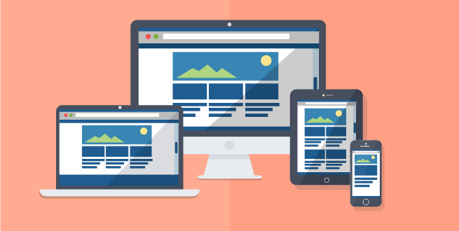
According to a study in 2013 by Litmus, more than 44% of emails are accessed on mobile devices. Another study led by KISSmetrics points out that 89% of users open their inboxes in smartphones or tablets and they cant view the message correctly, so they choose to delete it. The data lead us to reflect the following: with so many users addicted to the remote access you must think of an alternative to keep them at your database, besides facilitating the email to be opened from everywhere.
Today you can read an email from your mobile phone, tablet or computer. For this you can use Gmail, Outlook, Yahoo or any other email provider you prefer. Each one will receive the same email marketing campaign in different ways. For none of them have problems or view the message incorrectly, you can count on two features: the Responsive Design and the Scalable Design. The idea of this post, however, is not going into detail about the design itself, well leave this discussion to an opportunity ahead. Our goal now is to show the possibilities that can be developed by designers, for us or for anyone who wants to try on their own.
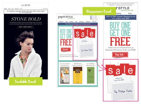
So let's go to the presentations starting with the scalable design. The concept of Scalable Design is to simplify the most an email layout through a single large and differentiated text, followed by a call to action in the same proportions. Typically, the entire set is designed in a single column that shouldnt exceed 500px wide. Thus, the reading is not affected, regardless of the device or email provider, and the campaign can be viewed correctly.
The term Responsive Design is applied when the email code is modified in order to adapt the size of texts and images according to the display resolution when its accessed, meeting computers to notebooks, tablets and smartphones. This means that, with the change, the content can be viewed in a single column if the screen is too small or have its own way appropriate as the screen increases.
If I had to choose between the two, at first glance, responsive design is the best option (or at least seems to be the best) for the preparation of email marketing campaigns that also meet mobile devices. However, the resource demands a lot of work in the development of the email code, which can hardly be carried by someone without knowledge in the area.
So here are some tips that can help you determine the best way:
1) Review the reports of "User Agent"
Make an analysis of the balance of "User Agent" to find out if there are many interactions via mobile devices. Depending on the outcome you might encounter maybe your list doesnt need a scalable design, at least not with such urgency.
2) Your site is "mobile friendly"?
There is no point having a website with super optimized design if it doesnt work for mobile.
3) Do you have time and resources?
This can often set the path you should follow. A responsive design can be beautiful and functional, but it requires time and knowledge while a scalable design might not be as effective as the other one, however, easier to apply.
What do you think? Which one your contacts will like?
Did you like the content? Share it!
We are at social networks, so go there and tell us what you think about the tips we posted to you!
Facebook, Twitter, LinkedIn, Google+
Do you have any questions about the platform or suggestions for our blog? Send it to us through the comments!