Learn how to read your email marketing reports and make decisions in 3 minutes
Published in september, 19 of 2015
On last weeks Monday, we received a question from one of our customers which, somehow, had already been reported at other times. The emailmanager gathers much pertinent information about email marketing campaigns routing, but where to start? What do you really should look if you have only three minutes to devote?
Today we will show you should observe to learn quickly if sending your emails was adequate, reaching high, medium or low deliverability. In the latter case, we will analyze urgent steps to reverse the situation. To understand better, let\'s use the data from Consolidated Report of one of our clients as a practical example.
This is the best way to have a complete analysis regarding email marketing campaigns sent by your company. Without being too brief as in the Dashboard or with too much information as shown in the reports separately. With indicators from the Consolidated Report, you will have enough to know their successes and what needs improving.
Understand, by numbers, the right email marketing
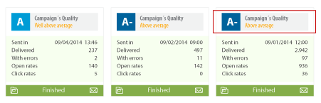
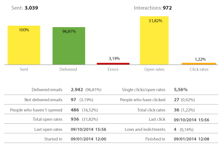
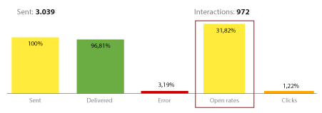
To start our clients campaign, the assessment was A-, which is very good and simplify our work. The emailmanagers evaluation system compares your sendings with everyone else by following simple metrics such as percentage of interactions and rebounds, and amount of Spam complaints or Spam Trap. In this report, we see the campaign had a good amount of interactions, primarily through the Open Rate (31.82%).
This percentage is due, in majority, to the composition of the campaign, created in a single image. It takes readers who want to see it to download all the content, counting openings. Having the whole content in a full image, the subject line has to assume the key role. If the title is relevant its going to lead to openings, otherwise we wont have much more content to guide us. So, in this case the subject line and the content type generated a respectable Open Rate.
Also in this thought line, we can see the total openings than double the amount of people who opened the email. Generally, they are called "unique openings." From this piece of information, we can deduce that the content has sparked interest, since people opened the email at least more than once.
Now, see what can be improved in email campaigns
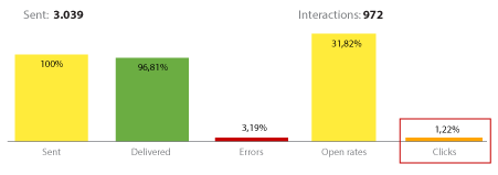
The amount of clicks is low, especially if compared to the percentages of openings. This is a factor to be analyzed concretely, after all, why so many openings didnt convert in clicks?
Quickly observing the delivered email marketing campaign, we have seen it didnt have a "call to action" clearly and visible. This is reflected in the loss of focus and turn email into a form of communication merely informative. The lack of a guide simply telling the reader what we want they to do after reading the email generates loss of a good amount of vital clicks vital, mainly because this email wasnt merely informative.
Finally, the amount of generated errors has been reasonably high, a little over 3%.
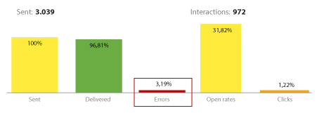
Although the percentage is negative, there is no reason to concern, since its above average industry standard (1%). Moreover, we should constantly seek generating the least amount of errors possible, since this is crucial to ensure deliverability to your email marketing campaigns.
To complete this analysis, we recommend that you review the Errors Report in Regular Campaigns to see specifically what type of failure its generating. If the fail is pointed as a "Permanent Error", we have a problem in the way of collecting emails, and this should be improved. In this example we showed, most of the errors was like "Temporary Error", more specifically rejected at destination. At the beginning of this post, we saw that this campaign was entirely composed of an image. Another important fact is that it was directed almost exclusively to companies, which have very strict filters to receive emails (especially those composed of images only). Therefore, you should try sending campaigns with more balance between images and texts to see what happens.
Now, after writing it seems a lot to do, but believe us its nothing. Apply these tips a few times and see that soon its gonna be automatic. Open a Consolidated Report and analyze what catches your attention, whether good or bad. Everything is valid.
Did you like the content? Share it!
Facebook, Twitter, LinkedIn, Google+